2026 / Brand & Digital Product
Kriwil
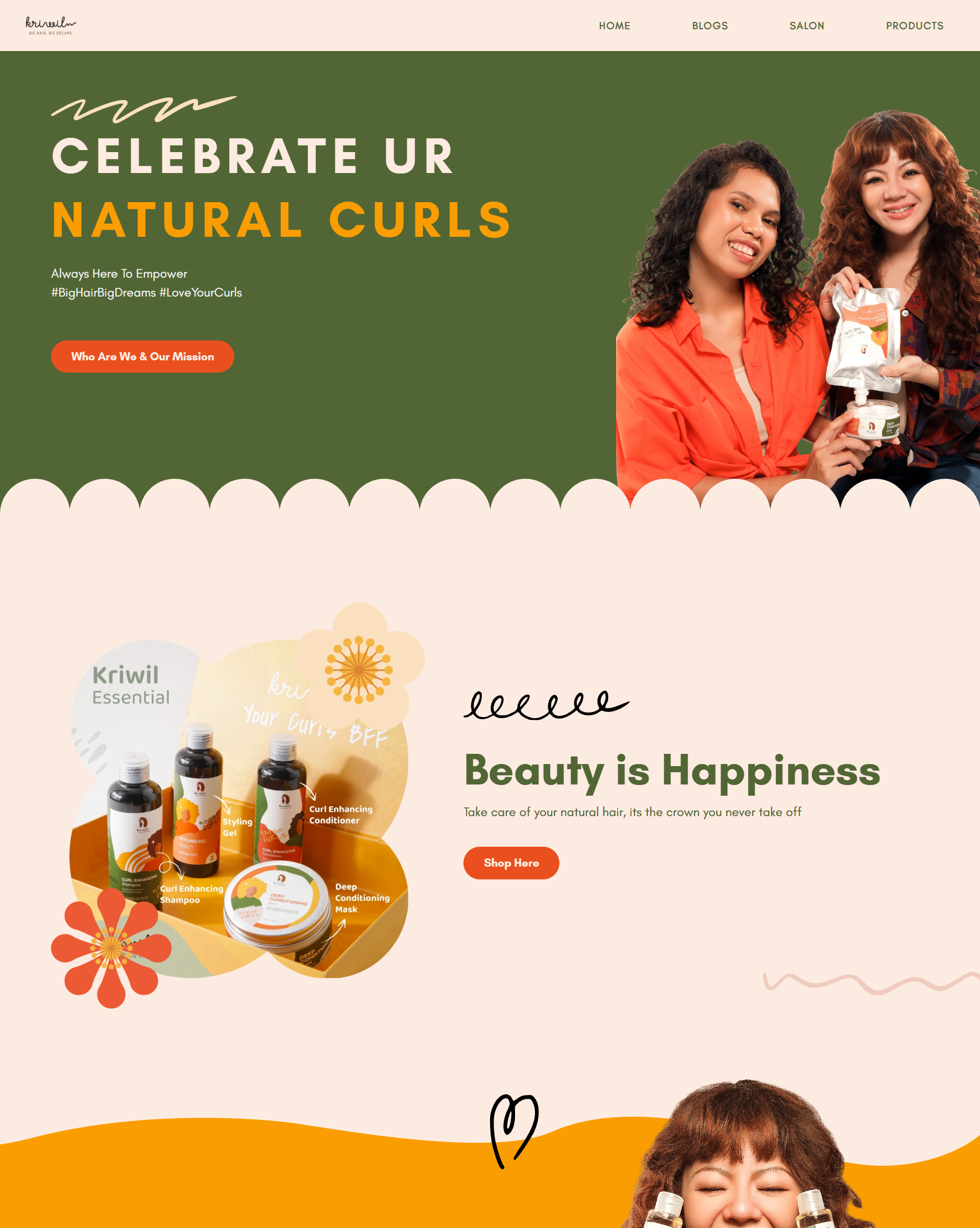
A playful landing page direction for a curly hair salon brand, designed to feel friendly for women and kids while preparing the interface for future commerce.
- Role
- Product Design / Frontend Engineering
- Platform
- Responsive web / Brand surface
- Timeline
- 2026
- Stack
- React / Tailwind CSS / Responsive Design
Kriwil is a curly hair salon brand with branches in Jakarta and Surabaya. The owner wanted a landing page that captured the salon personality: curly, fun, warm, and approachable for women and children discovering treatments and products for textured hair.
The challenge was to make the page feel cute and expressive without turning it into decoration only. It still needed to help visitors understand the salon, feel welcomed by the brand, and see a path toward future product discovery and marketplace features.
01 / Contribution
What I shaped.
- Shaped the landing page structure around brand introduction, audience warmth, and clear visual hierarchy.
- Translated the curly and playful brand personality into soft shapes, cheerful product moments, and friendly responsive sections.
- Prepared an expandable dummy design base so the experience can grow from a landing page into marketplace-style product discovery.
02 / Product decisions
Key decisions.
Decision 01
Make the brand feel fun without losing the offer.
The visual direction uses playful curls, rounded shapes, bright product imagery, and friendly copy, while keeping the main message and call to action easy to scan for first-time visitors.
Decision 02
Design for women and kids from the first impression.
The page avoids a cold beauty-clinic tone and instead leans into a softer, happier visual language that feels approachable for families, parents, and curly-haired customers looking for care.
Decision 03
Leave room for product discovery later.
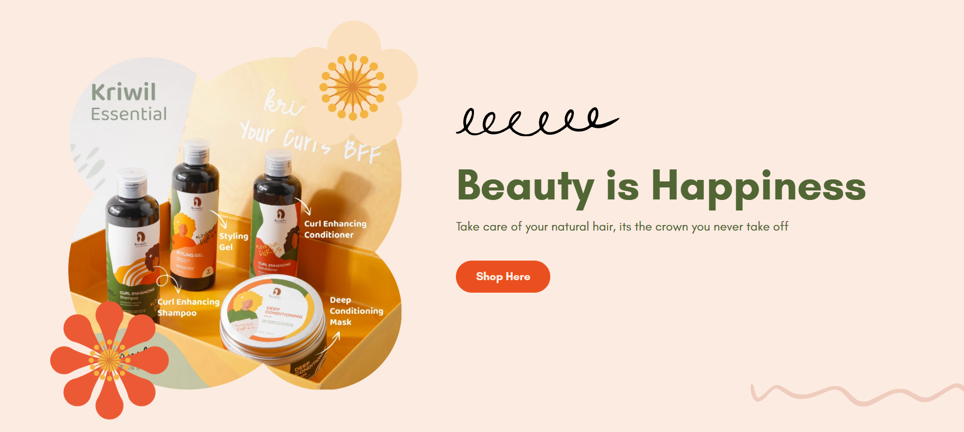
The landing page was treated as an early product surface, with reusable sections and product-focused areas that can evolve into shopping, catalog, and marketplace flows as the business expands online.
03 / Interface
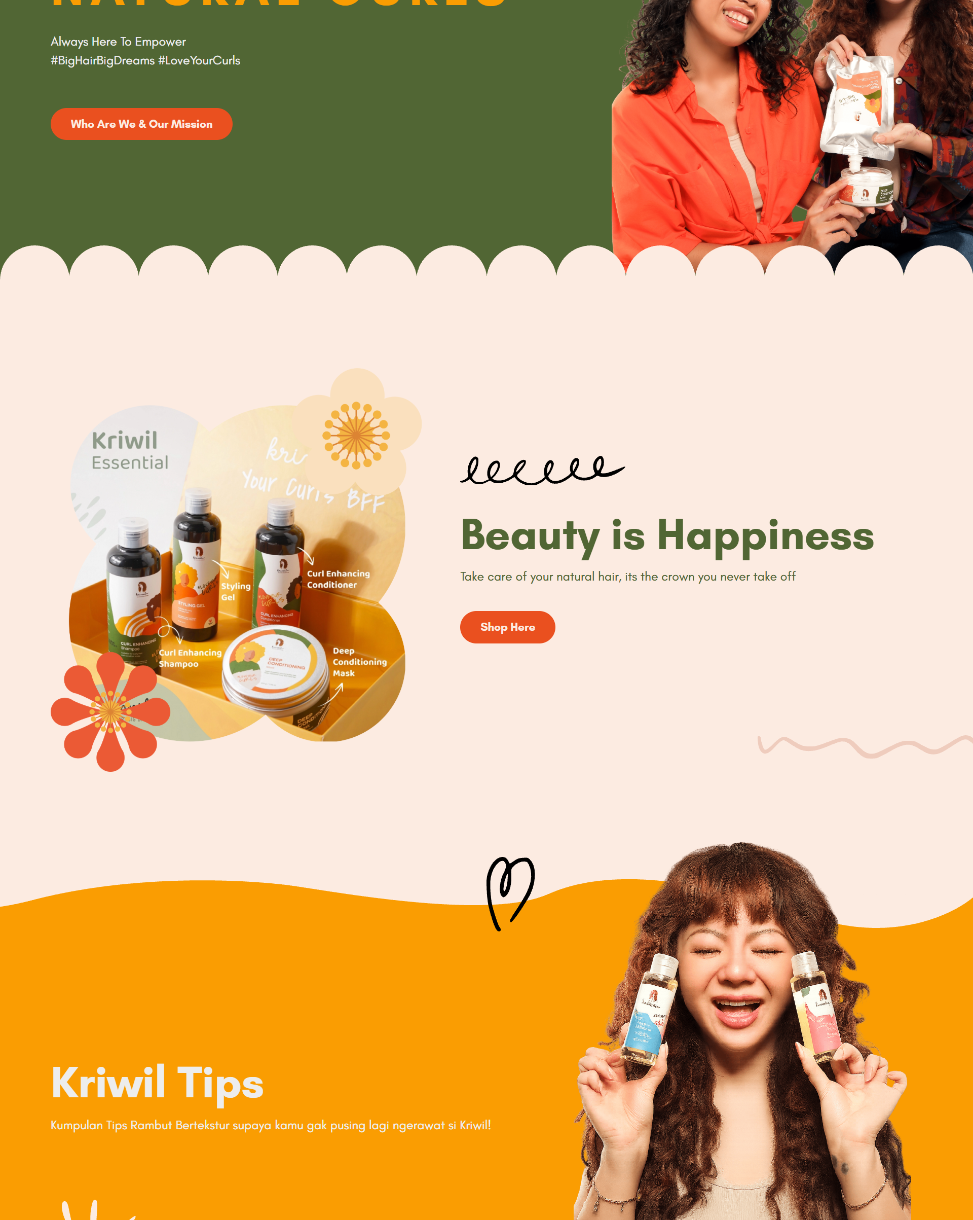
Screens and states.
04 / System
Designed in systems.
The design system direction keeps the salon personality visible through curly shapes, warm product-led imagery, soft rounded sections, and cheerful calls to action, while staying modular enough for future marketplace pages.
- Curly shape language
- Playful landing sections
- Product preview blocks
- Family-friendly tone
- Marketplace-ready components
05 / Frontend
Built for responsive use.
The frontend direction focuses on a responsive landing page foundation that can hold brand storytelling now and support deeper product or service discovery later.
- Responsive layout sections for salon introduction, campaign messaging, and product highlights.
- Reusable visual blocks prepared for future catalog and marketplace expansion.
- Image-led composition that keeps the brand expressive while still readable on mobile.
06 / Outcome
What this enables.
- A landing page concept that communicates Kriwil as a curly hair salon with a distinct, friendly personality.
- A visual direction that feels more aligned with women, kids, and families than a generic beauty website.
- A flexible base that can be extended into product discovery and marketplace flows.
For Kriwil, the design needed to feel as expressive as curly hair itself, but still work as a business surface that can grow beyond a landing page.
Next project