2020 / Creative Studio Website
WeekGenz
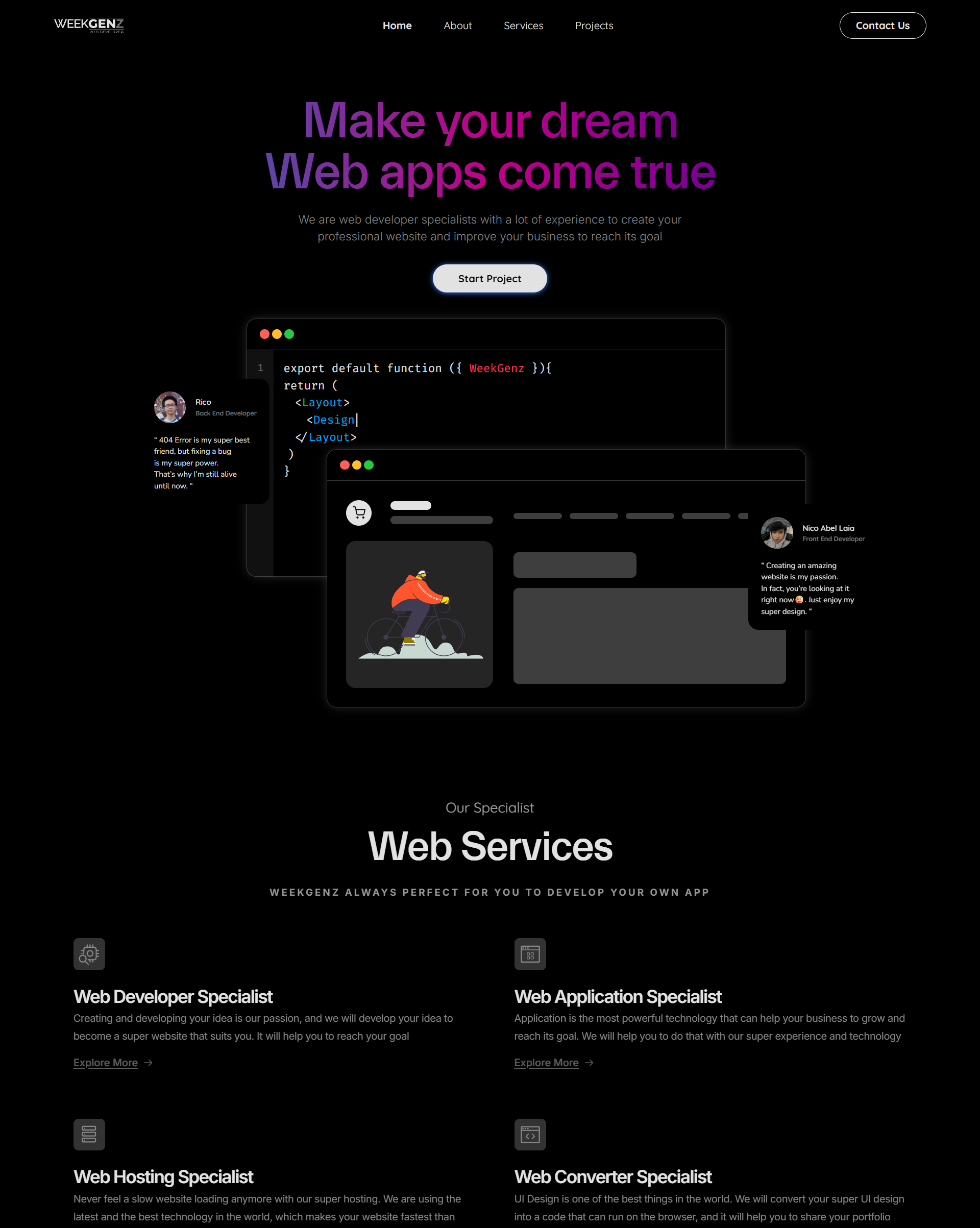
A digital agency identity for the studio I built with my friend, shaped around minimal layouts, bold typography, and code-driven visual details.
- Role
- Creative Direction / Frontend Engineering
- Platform
- Responsive website / Studio profile
- Timeline
- 2020
- Stack
- Next.js / React / Tailwind CSS
WeekGenz needed a web presence that could explain the studio clearly while still showing its design personality. The identity leans simple and minimal, but uses strong typography, confident spacing, and direct visual rhythm to make the brand feel sharp and memorable.
The challenge was to avoid making the agency site feel like a generic service page. It needed to communicate what WeekGenz does, show the product-minded side of the studio, and reflect our habit of building detailed visuals directly through code.
01 / Contribution
What I shaped.
- Defined the studio positioning around digital products, websites, and visual execution.
- Created a minimal layout system with bold, eye-catching typography as the main brand signal.
- Built visual and interaction details directly in the frontend so the site could feel crafted, not template-driven.
02 / Product decisions
Key decisions.
Decision 01
Use minimal structure with typography that carries the identity.
The site keeps the layout simple so the studio message stays easy to understand, then uses firm spacing, bold type, and strong contrast to make WeekGenz feel confident and memorable.
Decision 02
Present WeekGenz as a studio that also builds products.
The content direction highlights that WeekGenz is not only an agency service, but also a place where digital products are explored and shipped, with Pastirumah as the latest product example.
Decision 03
Let frontend craft become part of the brand.
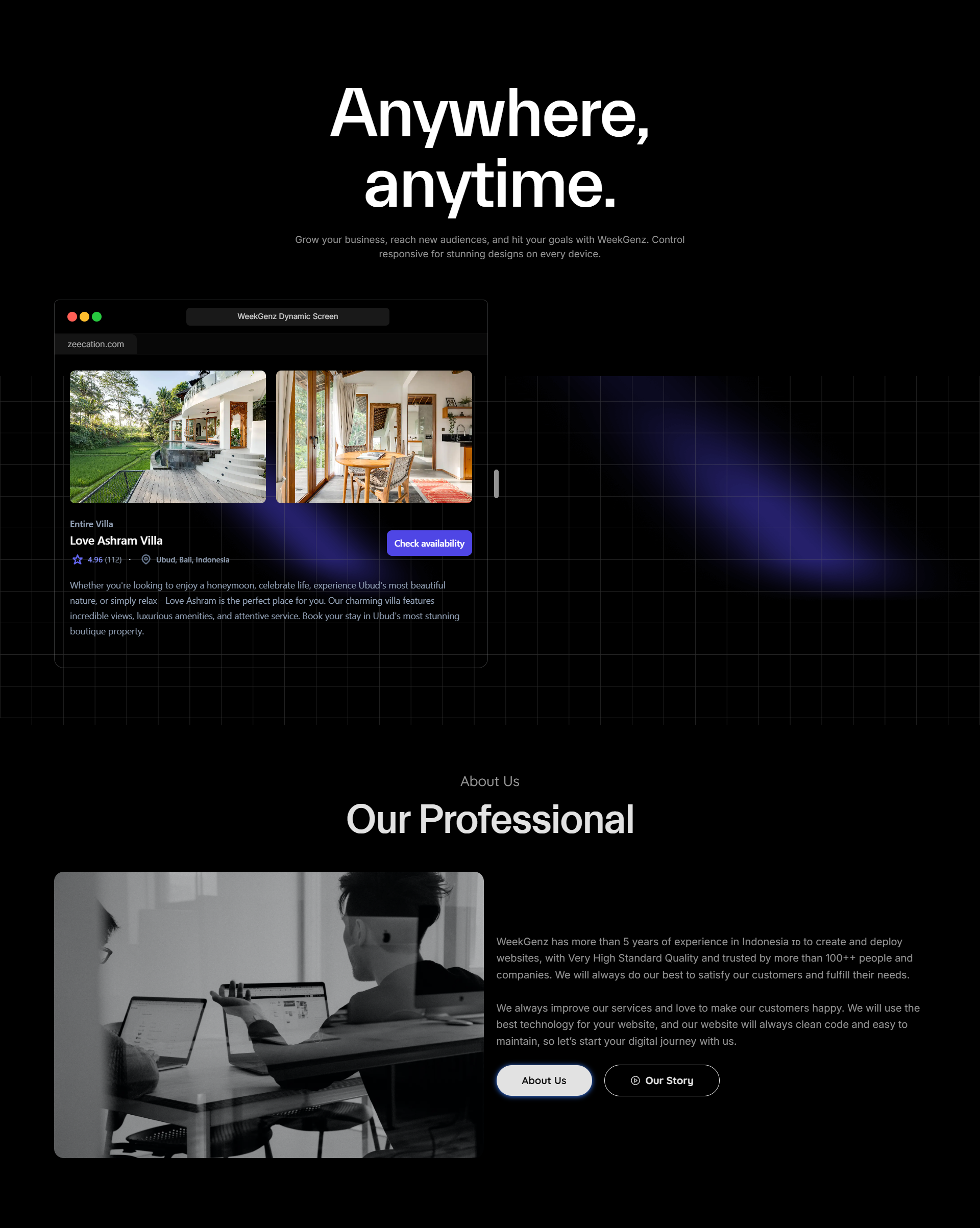
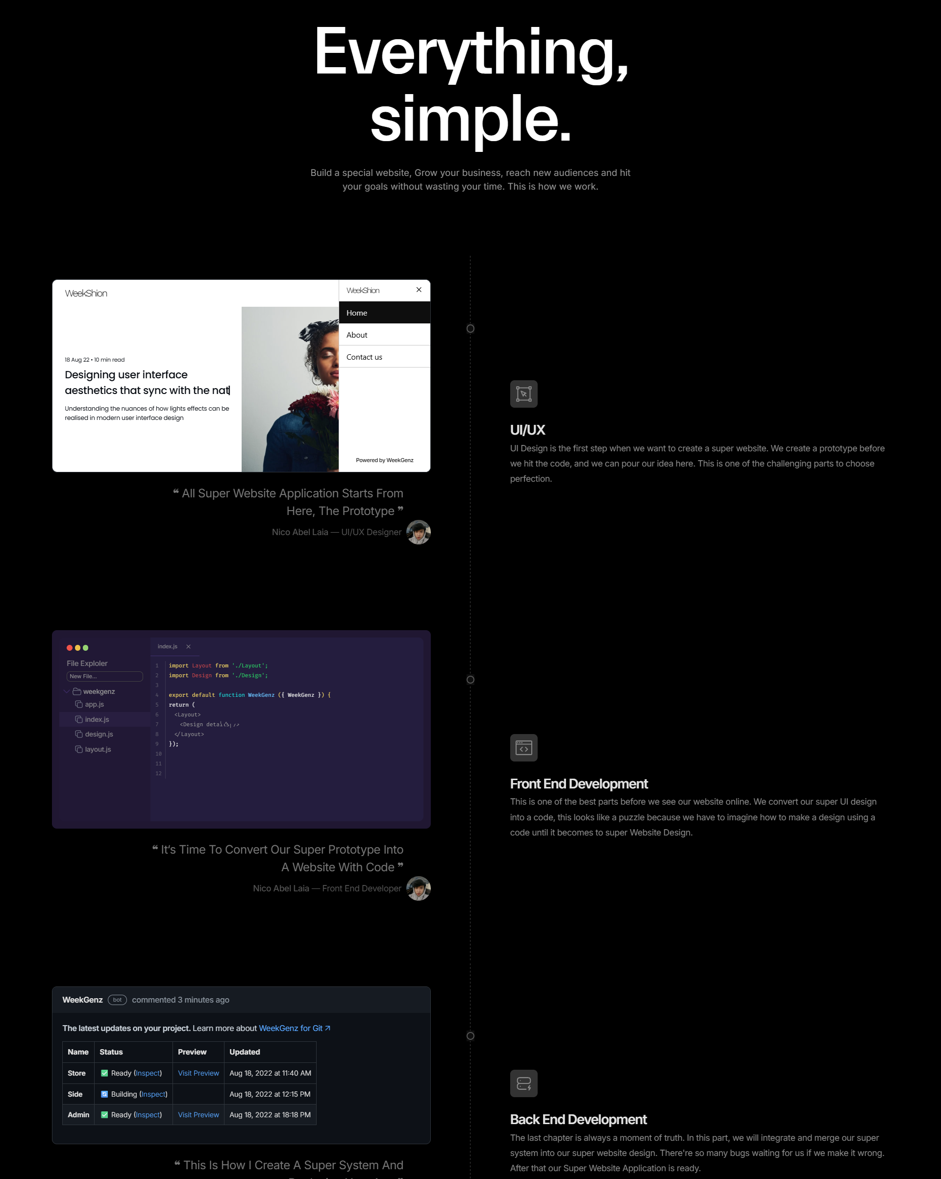
Instead of relying only on static visuals, small layout details, motion behavior, and visual accents are created directly through code to show the studio’s design and engineering taste.
03 / Interface
Screens and states.
04 / System
Designed in systems.
The WeekGenz visual system is intentionally simple: monochrome-leaning surfaces, strong typographic hierarchy, direct spacing, and coded visual details that can adapt across agency pages and product showcases.
- Bold typography
- Minimal page rhythm
- Product showcase sections
- Code-driven visual details
- Responsive studio identity
05 / Frontend
Built for responsive use.
The frontend direction turns the studio identity into a responsive website with reusable sections for positioning, services, product work, and future portfolio expansion.
- Responsive sections that keep the brand direct and readable across screen sizes.
- Reusable content blocks for agency work and internal digital products.
- Code-built visual details that support the studio identity without making the page feel heavy.
06 / Outcome
What this enables.
- A clearer identity for WeekGenz as a digital agency and product-minded studio.
- A portfolio surface that can connect studio credibility with products like Pastirumah.
- A minimal but recognizable visual direction built around strong typography and frontend craft.
WeekGenz works best when the design feels simple at first glance, then reveals care through typography, spacing, interaction, and the small details built in code.
Next project